Friday, February 11, 2022

Primary Bathroom Renovation

  There was nothing wrong with our primary bathroom. It was fairly neutral with builder-grade... everything. The thing that bugged me the most was the way the room was set up, but I didn't know how to fix it. Or at least how to fix it without a major renovation. The shower stall is wedged into a corner, the giant jet tub overpowered the room, doors everywhere, and worst of all, the giant meaningless space right in the middle of the room. When thinking about updating the bathroom, it quickly turned into major structural changes, and I (Mike Richardson) was not up for that at all. 

I started pinning what I liked on Pinterest, and I knew exactly the look I wanted. Of course, I wanted it to feel like a spa (who doesn't) or a boutique hotel, or a Parisian apartment. So yeah, low expectations. I wanted to pick things that would not date themselves. In general, I prefer a very traditional design aesthetic, so I knew I wanted timeless materials. What says traditional more than marble? I picked a beautiful off-white brushed marble wall and floor tile. I selected a few different shapes as I wanted a border around the room. For the border, I picked a mosaic mother-of-pearl tile for a little bit of glam. And Mike picked a hex-shaped tile for the shower floor. 

We decided to leave everything in its place, except we extended the shower out approximately a foot and we shifted the tub over a bit.  

I wanted a vintage furniture piece for the vanity, something I could put some elbow grease into and fix up myself. I found a mahogany buffet on FB Marketplace for $70! It had a high gloss lacquer finish on it and some deep scratches, but none of the damage ruined the veneer, so I knew I could refinish it successfully. I still can't get over the fact that it only cost me $70!!! It also reminded me of my mom and dad's bedroom furniture. They had a beautiful mahogany set with drawer pulls that were very similar. It's crazy, but every time I open one of the drawers, it takes me back to my bedroom when I was a kid and sounds like my mom opening her drawers in the next room. I love that little memory.  We had the countertop cut to the exact shape as the original wood top in gorgeous marble-looking quartz. As soon as I saw the slab at the granite store, it was love at first sight.  My hope is to make something from the wood top, but I haven't decided what I will make yet. 

We have zero storage in this bathroom for towels, so I bought a wood tower on Amazon. It was the perfect shape and size, but the color was just not right. I stripped and stained it to match the vanity (sort of) and it looks great. I just can't leave well enough alone; I always have to alter it! It's a problem, I know... but so worth it! 

The vessel sinks are unique in that they are not entirely on top of the counter. Half of the bowl is underneath and half is above. I think it looks so sleek, I love them. I mixed metals in this bathroom. Anything that is permanent, or should I say, more difficult to change is in chrome like the faucets, shower door hardware, and door handles. All the light fixtures, mirrors, and handles are antique brass. In the case of the drawer handles, they actually are polishable brass, and I am amazed what a little Brasso did on these beauties. 

The walls are an elegant plain off-white paint in a satin finish and the trim is the same color in semi-gloss. Speaking of the trim, Mike Richardson did the crown molding many years ago and it looks great, but he really outdid himself with the box trim all the way around the room. This trim is probably one of my favorite features in this bathroom. 

So, without further ado, let's check out the before pictures. Of course, I didn't think about taking before pictures for a future blog, so they are crappy, and I had a bunch of junk just lying around. Oh well, it may just make the transformation look even better.  

The door on the left is our bedroom and we are looking at a big unnecessary space next to the tiny shower. 


Oh Boy, this is the small shower stall. No shelf, no place to shave my legs, could not get it perfectly clean. 

See that vent on the bottom to the right? We extended the shower to the vent. That bought us a little over a foot of extra shower space. 

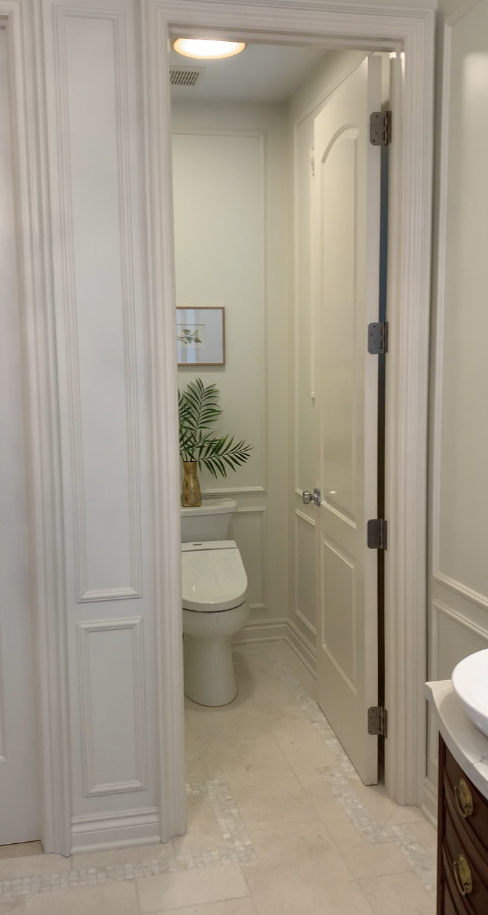
Door to our closet and door to the water closet. And that stupid scale that has been my arch enemy for years. 


Partial shot of the vanity. Builder-grade cherry cabinets, laminate counter, a giant slab of a mirror and you can't see in this shot, but a long chrome light fixture with big round white bulbs. 

I hate this tub! I always thought I wanted a jet tub, but turns out they are not all they are cracked up to be. As a matter of fact, they are gross! The few times I did fire that baby up, black stuff came out of the jets. Yeah.. gross. I'm sure I was supposed to maintain it in a certain way, but I didn't, instead I just never ever used it. It really was just a dumping ground until I could put things in their place.    

Let's take a look at the before pics of the buffet I bought on Facebook Marketplace for $70 bucks! (These are actually the pics from the listing) Look at the thick lacquer finish and the scratches and gauges. The handles are so tarnished and she was pretty dirty too.  Boy, is she a beaut! 


I stripped her and discovered this amazing tiger wood finish. What??? I loved it even more! 

In this pic, you can see how I evened out the stain for a more consistent look. You can also see the incredible freshly polished brass handles. 


Now... the moment we have been waiting for. 

This is a shot from my bedroom walking into the bathroom. You can see how we extended the shower and the new towel tower that I stripped and stained. It solved my towel storage problem and filled that unnecessary space. 


Better shot of the shower and towel storage. 

See how close the shower comes to the vent now? What a difference that little bit of space makes. The shower doesn't feel like a tiny dark stall anymore. 

Can we talk about how great it is to have a shelf for shampoo and soap and a ledge to shave my legs??? Game-changer!

Mike Richardson also beefed up the trim around the doorways with a stack moulding. So nice! 


So, the giant toilet seat...it's a bidet toilet seat! When we went to Italy, Mike Richardson fell in love with a bidet, so I had to get one for him for our bathroom. This is by far his favorite part of the whole project. It's big, it looks a little clunky, but it is AMAZING! 

Here she is! The finished vanity in all her glory! Isn't she gorgeous??????? And look at those light fixtures with the milk glass shades. Come on... how beautiful are they? 


The soaking tub is really quite nice, and a ga-zillion times better than the jet tub! Here is a little fun fact, the artwork is downloaded from the Smithsonian open access. I knew I wanted vintage botanicals, so I downloaded them, print them on cardstock, and added them to Ikea frames. This art cost me around $22 TOTAL! Seriously, does it look like it was only $22???


Notice the mother-of-pearl border that goes all the way around the room. It's subtle, but I love it!!!

And let's not forget about this freaking chandelier!!! This chandelier is the cherry on top, the icing on the cake, the star on the tree… what else can I say? It is just so darn awesome!  This is another Amazon purchase for under $100 and it looks like it’s worth a million dollars.


I could not possibly love this bathroom more than I do. These cell phone pictures do not even do it justice. I wish you could see it in person, you would fall in love too. Every family member and friend that we have had over to the house since we finished it is forced into the bathroom within mere minutes of stepping in the front door. I can't help it, I just love it so much and I want everyone to see it. I am pretty proud of this project, that is for sure. 

Let me know what you think.


~Sheila

If you enjoyed this article, get email updates by entering your email address in the "follow by email box" located in the right side pane of the full website version.

Viewing this article on a cell phone? Please go to the web version to enter your email address to follow.


Monday, February 11, 2019

Girls Hockey Tournament Door Signs

My youngest daughter is on a hockey team that is on FIRE! Cue Alicia Keys singing "That girl is on fire". Let's all sing now!

This group of girls is really something special. Not only are they skilled hockey players, but they are friends and the definition of teammates. They have had an amazing season of winning because they play as a team. It's been fun watching them get closer over the last few years. Heck... it's been fun watching them be able to intentionally pass the puck and then actually catch the pass! That sounds silly, but they have come a long way since the beginning! Now, here they are 12 & 13 year old girls who have taken on older teams, a boys team & teams a tier higher than theirs and won! With grace too may I add. They play hard and they really have fun doing it together! How can you beat that? It almost sounds too good to be true!

A couple of years ago we had a super creative mom (shout out to Jen) who made personalized hotel door signs for a Toronto tournament. They were hockey skates made from card stock and laminated. That door sign is on Julia's bedroom door today and has been since we got back from the tournament. We have since been to many other tournaments, but Jen and her daughter  moved to another team and the rest of us kind of dropped the ball. To be honest, we had big shoes to fill. Jen did a bunch of fun and creative things for the girls all season long.

This year, I wanted to revive the hotel door tournament sign. What kid does not love their name on stuff? What player (of any sport) doesn't want to see their number on everything? Wait... let me just keep up with the honesty here... what MOM does not want to see her kid's name and number on everything??? We want to see their name in lights! We want to see it on stage! Sometimes, I only see my kid. As if a spot light is shining down on her and her alone. It almost seems like a problem. Moms just can’t get enough.

My name is Sheila Richardson and I AM A MOM!

So anywho... I bought the Silhouette Cameo 3 as a little gift from Me to Me last year and I am absolutely in love with this machine. I can't get enough of this thing! No blank surface is safe! I even tried to put hubby’s name on his cell phone. Yeah, that suggestion didn’t go very well.

 I wanted to make something that the girls would keep just like Jen did, so I came up with a banner. Actually, I decided on a banner. Meredith's mom Sue is the one who suggested a banner when I told her I wanted to do something. Thanks for the idea Sue!

Armed with the Silhouette Cameo 3, glitter heat transfer vinyl, team colors, and the names/numbers of all of the girls, I was ready to make these banners. Check out the hockey players, they have long hair. I was not about to put a generic silhouette on these. I wanted them to clearly be girls.

In true Sheila style, I only have a few pics of some of the banners.

WHY? WHY can't I get my picture game together?????


I am happy to report that they won the Buffalo outdoor tournament and brought home some hardware. The trophy made an appearance at Niagara Falls on the way home. 

Pretty awesome! 


Photo Credit: The Castle Family

~Sheila

If you enjoyed this article, get email updates by entering your email address in the "follow by email box" located in the right side pane of the full website version.

Viewing this article on a cell phone? Please go to the web version to enter your email address to follow.

Tuesday, August 8, 2017

Neighborhood Entrance

We moved into our home in March of 2009. It was still cold and needless to say there wasn't much growth on the trees or bushes. The entrance to the subdivision looked kind of like the entrance to a state park. I was certain that would change once spring was here. I was confident there would be a spring cleanup and flowers would be blooming and it would be amazing.

W R O N G!

It turns out that this particular entrance to our subdivision has been neglected for years. There were actually many good reasons it was neglected as the HOA had to deal with many issues with the township. (I mean... it probably didn't need to take as long as it did, but whatevs) 

Of course I don't have a good "before" picture, but I was able to pull an old shot off of google maps. This pic shows how ugly it was but it doesn’t truly depict how over grown everything was before it was redone.


I did manage to get a shot of the state park looking sign. 


After attending many HOA Meetings, I offered to cleanup and plant the entrance myself.

BIG Mistake! BIG BIG Mistake!

The grounds were littered with garbage, bottles, and doggie waste bags. And the ground was so hard it was like digging into cement. To make matters worse, once I finally got everything cleaned up and planted, I found out there was no functioning water source. UGH!!! So I had to lug water from my house to keep the mums alive. The finished product looked better when I was done, but it was still mediocre at best.

Below are pictures taken before the mums were in full bloom. 


As I mentioned above, there were some good reasons why the entrance had not been addressed. Some that had to do with the neighborhood, but most had to do with limitations from the township.

I could make a long story longer, but I won't get into all of the details. Basically the major challenges were:

The sign had to be easily removed if necessary and the distance to the road was important so that meant we could not build a permanent structure and current sign could not be moved from its current location.

The size of the island and the distance to the road meant no sign in the island.

Property owned by the hospital meant no landscaping on the right side of the entrance

Although there were several things going against a proper entrance, I knew we could still make it nice so I pitched an idea to the HOA. All of my suggestions took the above challenges into consideration. I suggested we paint the existing sign and build columns out of stack-able stones on each side. This way they could be easily removed should the township need to access the pipes and other things located under the sign.

I also pitched landscaping ideas. My original pitch included full color pictures that I literally cut and pasted together to provide a visual. Admittedly, I had some grand plans originally. My plan included a million more flats of annual flowers, but planting that amount of flats every year comes at a cost. All 4 entrances have to be evenly and fairly maintained.

Another priority was to select trees that would help conceal the yard of the home behind the entrance.

The president of the HOA was able to work with the township and they agreed to let us paint the sign and add removable stone columns. HUGE WIN! Of course there was a small catch. We could not move the sign from its current location. UGH! But OK, we can work with that.

The HOA let me pick materials and select plantings for the entrance and I loved every second of the process!

Then, the HOA took a leap of faith and let me paint the sign!!! They don't really know me. They don't know what I am capable of doing. But they trusted me! I mean... I was cheap. I only charged the cost of supplies, so how could they pass up that deal?

I wanted to gold leaf the letters and paint the sign black. I was prepared for the time-consuming task of gold leafing, but then I ran into my neighbor Lou who said, "ya know they make liquid gold leaf". WHAT??? They do??? Once I found that out, liquid gold leaf it was! And it turns out it is so much more affordable and easier to apply.

Check out this beauty!


I started by scraping the loose paint, filling cracks with wood filler and a lot of sanding. I painted the letters a base of yellow paint before the gold leaf paint. 


After getting everything taped and painted, I finished it with what seemed like  a million coats of water-based polyurethane. 


After the sign was done the landscapers built the columns, placed the sign and planted. It was fall of 2016 and although it looked nice, it wasn't until this year that I appreciated how beautiful it really is! The flowers are in full bloom and I am so happy every time I turn into into my sub. There were a ton reasons why this shouldn't have ended up as nice as it did, but it is beautiful!  I can only imagine how beautiful it will be when all of the plants mature. 

BTW... I do not claim to be a photographer! LOL


~Sheila

If you enjoyed this article, get email updates by entering your email address in the "follow by email box" located in the right side pane of the full website version.


Viewing this article on a cell phone? Please go to the web version to enter your email address to follow.

Monday, May 8, 2017

Ribbon Rack

I have a lot of ribbon. So much ribbon I didn't know what to do with it. Who needs this much ribbon? Ummm...nobody! However, I've had a little bit of a thing for ribbon, especially when it is on sale!

I've always had a ribbon stash, but I never really had a great way to organize it. I’ve had it arranged in shallow boxes on a shelf, which was ok, but not the best because it took up too much space. I loaded all of the spools on dowel rods that I hung below shelves. I thought this would be the best way to store them, I was wrong… it was the worst. It was awful because when the spool runs out, you have to take every spool of ribbon off the rod in order to get the empty one off. I didn’t want to take them all off so I ended up having a bunch of empty spools on the rod. I even tried stacking them, but not surprisingly this didn't work because they just got knocked over.

It's no secret I spend a fair amount of time on Pinterest and I came across this tutorial for a stand-alone ribbon rack. http://nicholeheady.typepad.com/capture_the_moment/studio-ribbon-storage.html
Now we're talking!


This type of storage is ideal, but I wanted my shelves mounted to the wall and I wanted it to be a lot bigger. All of the storage for our house is located behind 2 closets in my sewing room. The space between the closet doors was perfect for the ribbons.

I showed Mike Richardson the ribbon storage that I liked. He took a few measurements, we headed to Home Depot for supplies, and by that evening I had ribbon storage!!!

I planned on painting it to match the closet doors, but the natural wood is the same color as the floors and I think I like it as is.

Believe it or not, it ended up being way more storage than I had ribbons. 


The size ended up being perfect because now I had room for all my rolls of tulle, all-purpose thread (embroidery thread is a whole other story) and best of all, my collection of beads. I found these great flip-top containers at Dollar Tree by the seasonal plastic plates and picnic-ware. They were 3 for a dollar and fit great on the shelves. 

 I am so in love with this rack!!!


I mean, come on, do I have a great rack or what????


~Sheila

If you enjoyed this article, get email updates by entering your email address in the follow by email box.
 If you are viewing this on a cell phone, please go to the web version to enter your email address.


Saturday, December 17, 2016

DIY Christmas Throw Pillows

I bought a new bench for the basement and it just sat there all by itself. Lonely and sad. I had to give it some life and I knew throw pillows would do the trick. There was no way I was going to spend money on new pillows so I rifled through my fabric stash and found an old cream-colored canvas drapery panel from 17 years ago. These drapes hung in the living room of the house we rented with our friends Brian & Krista in Mississauga, ON. Back then Mike and I went in the woods and cut down the perfect branch that served as a unique drapery rod.  It was well before the rustic-chic movement, I must have been on the cutting edge of design! Okay, maybe I was just resourceful and on the tightest budget ever.
So... why do I still have them??? I'm glad I do!

I cut 4 squares of the canvas panel into 16" x 16" pieces. 

Then I printed off a pattern of a deer head and of a Christmas tree. (The deer head pattern is actually a picture of a deer head pillow).


My daughter Mikayla has a bunch of old dance costumes stored in her closet. One of those costumes was entirely made out of gold sequin which I used for my deer head. I purchased 1/4 yard of red sequin for the tree.That is way more than I needed for this project, but who knows what I will need it for in the future.


Next, I ironed HeatBond to the backside of both the gold & red sequin fabric.


Once cooled I was ready to place my pattern on the front side of the fabric and cut. I originally thought I was going to make 2 deer pillows, but decided against it later.


Here the patterns are cut out and ready to be ironed onto the canvas.


I removed the HeatBond paper off the back of the cut-outs and placed in the middle of the pillow. I used a pressing cloth to protect the sequin when I ironed the cut-out to the fabric. 


Next a zig-zag stitch to give a finished look.


I sewed the pillow front and back together and stuffed with fiberfill I had on hand. The fiberfill was leftover from Boo Day at work last year. It played the part of fake snow in Candy Land for Halloween. I was happy to to take the leftover. That stuff isn't cheap!

Here is the finished product. Looks plain though right? What can I do?


I found 4 cloth Christmas napkins that I have been meaning to use one year for dinner. I've had them for years, but just moved them from one Christmas box to another. I finally used them! I sewed them together and filled them with fiberfill and viola, more throw pillows!


This was a super quick and fun project! 

~Sheila

If you enjoyed this article, get email updates by entering your email address in the follow by email box.
 If you are viewing this on a cell phone, please go to the web version to enter your email address.